Comparison of glmnet and varbvs in Leukemia data set
2017-07-21
This vignette demonstrates application of glmnet and varbvs to the Leukemia data set. The main aim of this script is to illustrate some of the different properties of Bayesian variable selection and penalized sparse regression (as implemented by varbvs and glmnet, respectively).
We use the preprocessed data of Dettling (2004) retrieved from the supplementary materials accompanying Friedman et al (2010). The data are represented as a 72 x 3,571 matrix of gene expression values (variable X), and a vector of 72 binary disease outcomes (variable y).
Vignette parameters
Begin by loading these packages into your R environment.
library(lattice)
library(latticeExtra)
library(glmnet)
library(varbvs)
Specify settings for the glmnet analysis.
nfolds <- 20                    # Number of cross-validation folds.
alpha  <- 0.95                  # Elastic net mixing parameter.
lambda <- 10^(seq(0,-2,-0.05))  # Lambda sequence.
Load the Leukemia data
Also set the random number generator seed.
data(leukemia)
X <- leukemia$x
y <- leukemia$y
set.seed(1)
Fit elastic net model to data
Here, we also run 20-fold cross-validation to select the largest setting of the L1-penalty strength (lambda) that is within 1 standard error of the minimum classification error.
# This is the model fitting step.
r <- system.time(fit.glmnet <-
       glmnet(X,y,family = "binomial",lambda = lambda,alpha = alpha))
cat(sprintf("Model fitting took %0.2f seconds.\n",r["elapsed"]))
# Model fitting took 0.06 seconds.

# This is the cross-validation step.
r <- system.time(out.cv.glmnet <-
       cv.glmnet(X,y,family = "binomial",type.measure = "class",
                 alpha = alpha,nfolds = nfolds,lambda = lambda))
lambda <- out.cv.glmnet$lambda
cat(sprintf("Cross-validation took %0.2f seconds.\n",r["elapsed"]))
# Cross-validation took 2.24 seconds.

# Choose the largest value of lambda that is within 1 standard error
# of the smallest misclassification error.
lambda.opt <- out.cv.glmnet$lambda.1se
Evaluate the glmnet predictions
Compute estimates of the disease outcome using the fitted model, and compare against the observed values.
cat("classification results with lambda = ",lambda.opt,":\n",sep="")
y.glmnet <- c(predict(fit.glmnet,X,s = lambda.opt,type = "class"))
print(table(true = factor(y),pred = factor(y.glmnet)))
# classification results with lambda = 0.2238721:
#     pred
# true  0  1
#    0 47  0
#    1  4 21
Visualize results of glmnet analysis
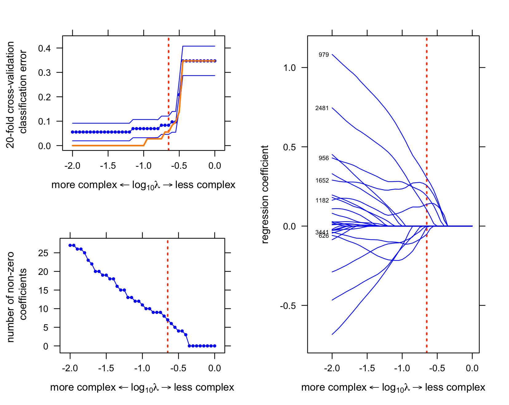
The first plot shows the evolution of regression coefficients at different settings of lambda. (Note that the intercept is not shown.) Only the curves for the variables that are selected at the optimal setting of lambda (“lambda.opt”“) are labeled.
The second plot shows the classification error at different settings of lambda.
The third plot shows the number of nonzero regression coefficients at different settings of lambda.
trellis.par.set(par.xlab.text = list(cex = 0.85),
                par.ylab.text = list(cex = 0.85),
                axis.text     = list(cex = 0.75))

# Choose the largest value of lambda that is within 1 standard error
# of the smallest misclassification error.
lambda.opt <- out.cv.glmnet$lambda.1se

# Plot regression coefficients.
lambda   <- fit.glmnet$lambda
vars     <- setdiff(which(rowSums(abs(coef(fit.glmnet))) > 0),1)
n        <- length(vars)
b        <- as.matrix(t(coef(fit.glmnet)[vars,]))
i        <- coef(fit.glmnet,s = lambda.opt)
i        <- rownames(i)[which(i != 0)]
i        <- i[-1]
vars.opt <- colnames(b)
vars.opt[!is.element(vars.opt,i)] <- ""
vars.opt <- substring(vars.opt,2)
lab  <- expression("more complex" %<-% paste(log[10],lambda) %->%
                   "less complex")
r    <- xyplot(y ~ x,data.frame(x = log10(lambda),y = b[,1]),type = "l",
               col = "blue",xlab = lab,ylab = "regression coefficient",
               scales = list(x = list(limits = c(-2.35,0.1)),
                             y = list(limits = c(-0.8,1.2))),
               panel = function(x, y, ...) {
                 panel.xyplot(x,y,...);
                 panel.abline(v = log10(lambda.opt),col = "orangered",
                              lwd = 2,lty = "dotted");
                 ltext(x = -2,y = b[nrow(b),],labels = vars.opt,pos = 2,
                       offset = 0.5,cex = 0.5);
               })
for (i in 2:n)
  r <- r + as.layer(xyplot(y ~ x,data.frame(x = log10(lambda),y = b[,i]),
                           type = "l",col = "blue"))
print(r,split = c(2,1,2,1),more = TRUE)

# Plot classification error.
Y       <- predict(fit.glmnet,X,type = "class")
mode(Y) <- "numeric"
print(with(out.cv.glmnet,
           xyplot(y ~ x,data.frame(x = log10(lambda),y = cvm),type = "l",
                  col = "blue",xlab = lab,
                  ylab = "20-fold cross-validation \n classification error",
                  scales = list(y = list(limits = c(-0.02,0.45))),
                  panel = function(x, y, ...) {
                    panel.xyplot(x,y,...);
                    panel.abline(v = log10(lambda.opt),col = "orangered",
                                 lwd = 2,lty = "dotted");
                  }) +
           as.layer(xyplot(y ~ x,data.frame(x = log10(lambda),y = cvm),
                           pch = 20,cex = 0.6,col = "blue")) +
           as.layer(xyplot(y ~ x,data.frame(x = log10(lambda),y = cvup),
                           type = "l",col = "blue",lty = "solid")) +
           as.layer(xyplot(y ~ x,data.frame(x = log10(lambda),y = cvlo),
                           type = "l",col = "blue",lty = "solid")) +
           as.layer(xyplot(y ~ x,data.frame(x = log10(lambda),
                                            y = colMeans(abs(Y - y))),
                           type = "l",col = "darkorange",lwd = 2,
                           lty = "solid"))),
           split = c(1,1,2,2),more = TRUE)

# Plot number of non-zero regression coefficients.
print(with(out.cv.glmnet,
           xyplot(y ~ x,data.frame(x = log10(lambda),y = nzero),type = "l",
                  col = "blue",xlab = lab,
                  ylab = "number of non-zero \n coefficients",
                  panel = function(x, y, ...) {
                    panel.xyplot(x,y,...)
                    panel.abline(v = log10(lambda.opt),col = "orangered",
                                 lwd = 2,lty = "dotted")
                  }) +
           as.layer(xyplot(y ~ x,data.frame(x = log10(lambda),y = nzero),
                           pch = 20,cex = 0.6,col = "blue"))),
      split = c(1,2,2,2),more = FALSE)
Fit variational approximation to posterior
Fit the fully-factorized variational approximation to the posterior distribution of the coefficients for a logistic regression model of the binary outcome (the type of leukemia), with spike-and-slab priors on the coefficients.
r <- system.time(fit.varbvs <- varbvs(X,NULL,y,"binomial",verbose = FALSE))
cat(sprintf("Model fitting took %0.2f seconds.\n",r["elapsed"]))
# Model fitting took 31.50 seconds.
Evaluate the varbvs predictions
Compute estimates of the disease outcome using the fitted model, and compare against the observed values.
y.varbvs <- predict(fit.varbvs,X)
print(table(true = factor(y),pred = factor(y.varbvs)))
#     pred
# true  0  1
#    0 44  3
#    1  3 22
Visualize results of varbvs analysis
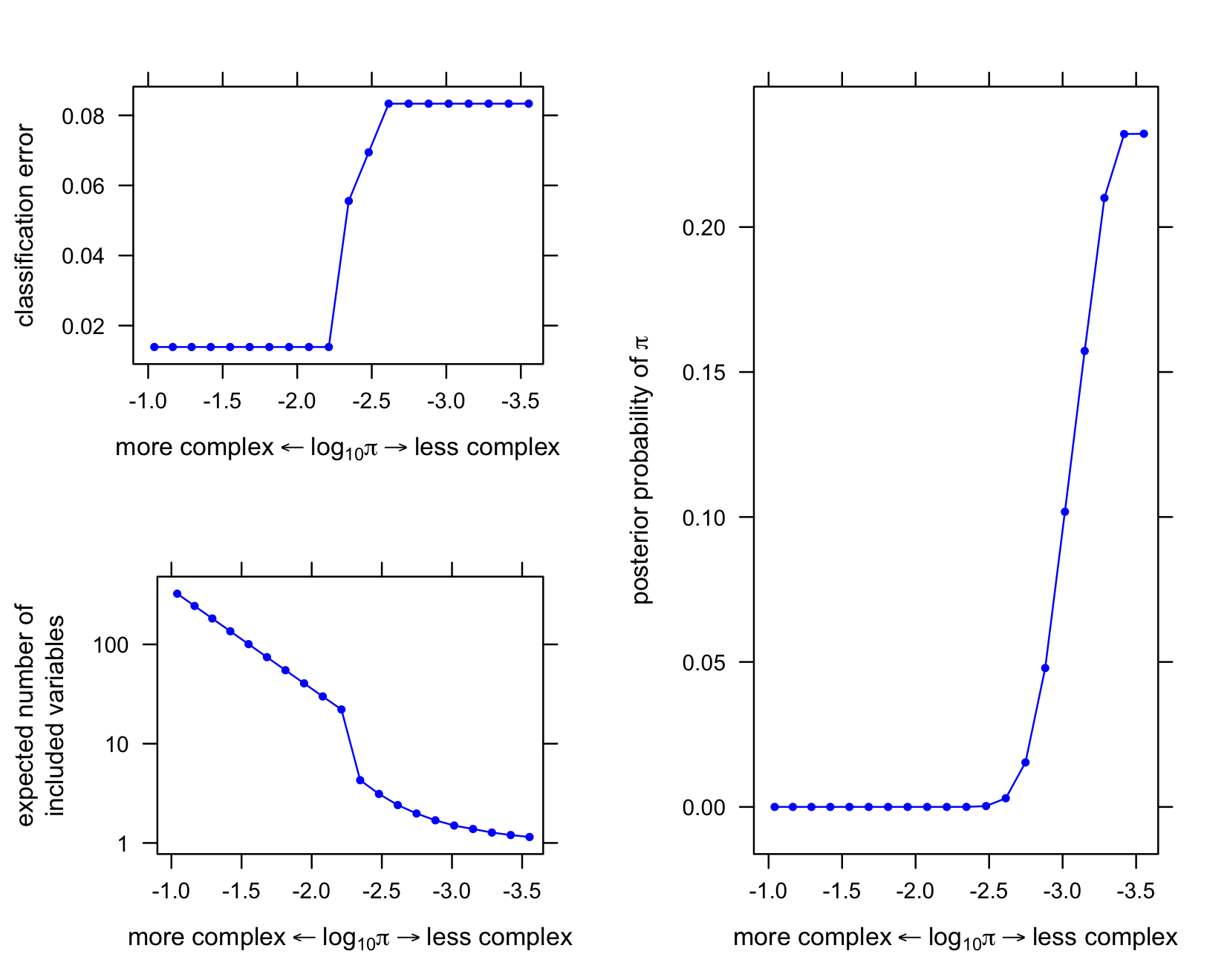
The first plot shows the classification error at each setting of the prior log-odds.
The second plot shows the evolution of the posterior mean regression coefficients (the beta’s) at different settings of the prior log-odds, for the top 6 variables ranked by posterior inclusion probability (averaged over settings of the hyperparameters).
The top-ranked variable (by posterior inclusion probability) has a much larger coefficient than all the others, so it is shown in a separate plot.
The third plot shows the (approximate) probability density of the prior log-odds parameter.
trellis.par.set(par.xlab.text = list(cex = 0.85),
                par.ylab.text = list(cex = 0.85),
                axis.text     = list(cex = 0.75))

# Get the normalized importance weights.
w <- fit.varbvs$w

# Plot classification error at each hyperparameter setting.
sigmoid10 <- function (x)
  1/(1 + 10^(-x))
logodds <- fit.varbvs$logodds
log10q  <- log10(sigmoid10(logodds))
m       <- length(logodds)
err     <- rep(0,m)
for (i in 1:m) {
  r      <- subset(fit.varbvs,logodds == logodds[i])
  ypred  <- predict(r,X)
  err[i] <- mean(y != ypred)
}
lab <- expression("more complex" %<-% paste(log[10],pi) %->% "less complex")
print(xyplot(y ~ x,data.frame(x = log10q,y = err),type = "l",
             col = "blue",xlab = lab,ylab = "classification error",
             scales = list(x = list(limits = c(-0.9,-3.65)))) +
      as.layer(xyplot(y ~ x,data.frame(x = log10q,y = err),
                      col = "blue",pch = 20,cex = 0.65)),
      split = c(1,1,2,2),more = TRUE)

# Plot expected number of included variables at each hyperparameter
# setting.
r <- colSums(fit.varbvs$alpha)
print(xyplot(y ~ x,data.frame(x = log10q,y = r),type = "l",col = "blue",
             xlab = lab,ylab = "expected number of\nincluded variables",
             scales = list(x = list(limits = c(-0.9,-3.65)),
                           y = list(log = 10,at = c(1,10,100)))) +
      as.layer(xyplot(y ~ x,data.frame(x = log10q,y = r),
                      col = "blue",pch = 20,cex = 0.65,
                      scales = list(x = list(limits = c(-0.9,-3.65)),
                                    y = list(log = 10)))),
      split = c(1,2,2,2),more = TRUE)

# Plot density of prior inclusion probability hyperparameter.
print(xyplot(y ~ x,data.frame(x = log10q,y = w),type = "l",col = "blue",
             xlab = lab,
             ylab = expression(paste("posterior probability of ",pi)),
             scales = list(x = list(limits = c(-0.9,-3.65)))) +
      as.layer(xyplot(y ~ x,data.frame(x = log10q,y = w),
                      col = "blue",pch = 20,cex = 0.65)),
      split = c(2,1,2,1),more = FALSE)
Session information
This is the version of R and the packages that were used to generate these results.
sessionInfo()
# R version 3.3.2 (2016-10-31)
# Platform: x86_64-apple-darwin13.4.0 (64-bit)
# Running under: macOS Sierra 10.12.5
#
# locale:
# [1] en_US.UTF-8/en_US.UTF-8/en_US.UTF-8/C/en_US.UTF-8/en_US.UTF-8
#
# attached base packages:
# [1] stats     graphics  grDevices utils     datasets  methods   base
#
# other attached packages:
# [1] varbvs_2.3-1        glmnet_2.0-5        foreach_1.4.3
# [4] Matrix_1.2-8        latticeExtra_0.6-28 RColorBrewer_1.1-2
# [7] lattice_0.20-34
#
# loaded via a namespace (and not attached):
#  [1] Rcpp_0.12.12     codetools_0.2-15 digest_0.6.12    rprojroot_1.2
#  [5] grid_3.3.2       backports_1.0.5  magrittr_1.5     evaluate_0.10.1
#  [9] highr_0.6        stringi_1.1.2    rmarkdown_1.6    iterators_1.0.8
# [13] tools_3.3.2      stringr_1.2.0    yaml_2.1.14      htmltools_0.3.6
# [17] knitr_1.16